Choosing Color Palette and Pantones When Creating a Logo
Chances are you were lead to this article because you want to know the importance of color palette when creating a Logo. The color palette is crucial for logo design. It conveys the brand’s personality and builds recognition. A well-chosen palette can greatly impact a logo and the brand it represents.
To create a successful palette, start by understanding color meanings. Blue conveys trust, stability, and professionalism, while red embodies energy, excitement, and passion. Choose a color that evokes the emotions you want customers to feel.
Another key consideration is color compatibility with your brand’s visual identity. This encompasses logos, websites, business cards, and promotional materials. Consistent color use is vital for creating a recognizable brand. At Opake we only design using Pantone when we know something will go to print.
Color also draws and retains customer attention. A well-designed palette can make your logo stand out, while a poor one blends in and is forgotten.
Pantones, also called PMS, are important in logo design. They use standardized color codes to keep colors consistent and accurate in printing and branding. By using Pantones, your logo’s color will stay the same on all materials. This helps brands have a consistent look. Pantones also lets you communicate specific color details to printers, reducing color mismatches and keeping your logo’s color true to your brand.
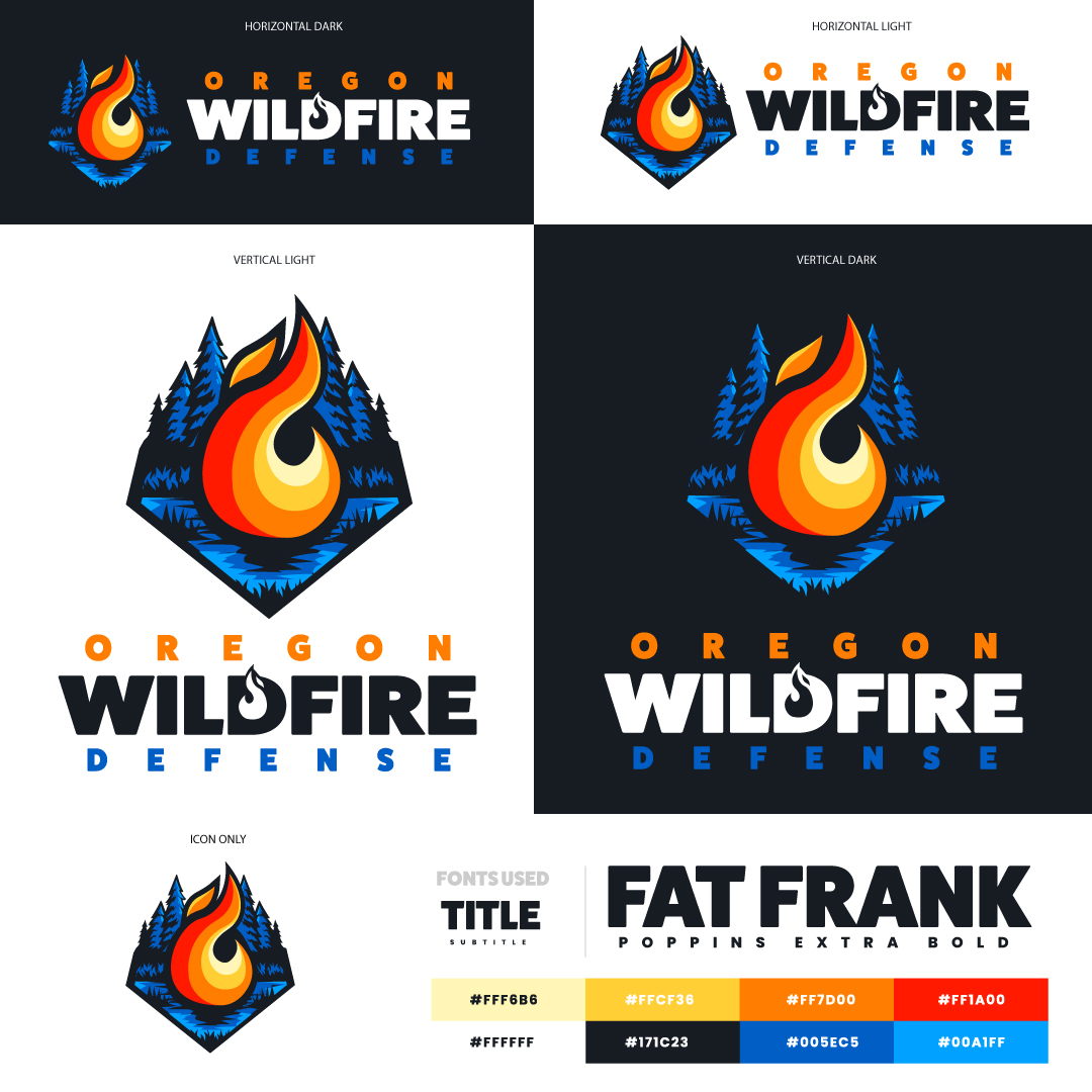
Lastly, your logo’s palette must be flexible enough to work in various contexts, such as on light or dark backgrounds, black and white, or grayscale. Flexibility is essential for reproducing the logo in different forms and media, contributing to brand success.
In conclusion, don’t overlook the importance of the color palette when creating a logo. Choose colors that convey emotions, maintain consistency, grab attention, and offer flexibility to create a memorable and effective logo for promoting your brand.


